Project title | Technical University of Liberec - visual identity
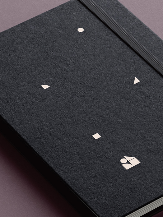
Project details | The letters T, U, and L (acronym used for by the university) are embedded in the logotype, and the shape is which they are organised resembles Jested tower that overlooks the city of Liberec.
Typeface | Meta Pro Light
Text | -
Photos | -
Mock-up | Graphic Burger (graphicburger.com)
